
Most consumers may not want to admit it, but the fact is that a great deal of psychological research goes into advertising. The emotional principles that drive the content and design of ads might be complex principles of behaviorism, or they may be as simple as the psychology of color.

As most marketers will tell you, color affects the viewer emotionally more than anything else. In fact, numerous studies have been conducted devoted to understanding which shades and hues produce what emotions in a person.
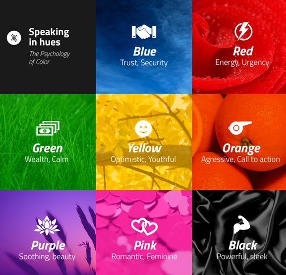
Take blues, for example. They have been found to promote a feeling of cool and calm. Blues inspires trust, loyalty, and tranquility. Like blues, greens can also have a calming, refreshing effect that comes with the association people give them with nature. Greens however are also the color of money, wealth and prosperity, and offer a more energizing and stimulating effect.
Let’s take the ol’ green chalk board for example. When presenting a chart which shows an increasing statistic, using this type of background will help enforce the aspect of growth while also providing a subtle shade of calm and familiarity.


Warmer colors, like red, naturally inspire the opposite effect. Red is associated with blood and aggression. It’s a passionate color that can signify love, but always acts as an attention getter and stimulator. It has even been reported that red heightens the heartbeat and breath.
Purple is often associated with royalty, wisdom, and respect. It stimulates problem solving as well as creativity. Consequently, we often see purple used to promote beauty and anti-aging products. Orange and yellow, on the other hand, are cheerful colors that promote optimism. Yellow can make babies cry, while orange can trigger a sense of caution. This is why warning labels are usually orange or yellow. This effect can also be used to draw in window shoppers by creating a sense of anxiety that can draw in impulsive buyers.
Black is king! Basically, this color is associated with authority, power, stability, and strength. It can be seen as a symbol of intelligence, but can become overwhelming if used too frequently. Meanwhile grey invokes feelings of practicality, old age, and solidarity. But too much grey can lead to feelings of emptiness and depression.

Now, think of the Pearly Gates. White has always been associated with feelings of purity, cleanliness, safety and can be used to project an absence of color or neutrality. White space helps spark creativity since it can be perceived as an unaltered, clean state.
While color is not the only important ingredient in a marketing strategy, it is the first thing that hits people and it can leave a lasting impression (for better or for worse). Never underestimate the power of that first impression. And don’t underestimate the power of the subconscious messages that colors send to your market especially in the age of digital marketing and design.
Of course, the psychology of color spans far beyond any infographic or rushed explanation that can be presented in a blog post. Furthermore, in each situation, the context in which any given color is being used is key. The target audience (e.g. gender, age group) can also clue you in as to which colors would be more effective, but these are the very basics of color psychology when it comes to advertising and digital marketing. If you happen to be in the process of developing a website or online presence, you never know, it might be something that you ought to consider.