
There was once a time, when we couldn’t think of the internet. But today we’re playing with it. And just like that, we never thought of such smartphones. But there we have them. This gives an idea that no matter how hard we try to avoid technology, we still end up with more and more new trends and technologies. So the moral is:
Blend yourself with the Latest Tech-trends, as we can’t escape them
One key area of concern for web developers and those wishing to have a new website is a mobile-friendly websites. A mobile friendly website is one that is both suitable for our computer systems and mobile devices. One website that fits with all. For this web developers around the world are either reshaping the old ones or creating new websites, best use for every device. We simply call them mobile-friendly websites.
With so many ways to get a new website, PHP is one of the most common, easy-to-use and widely operated scripting language. With so many websites developed in PHP, it is now the PHP developers’ job to reshape the new and the existing websites to run on every device. In this post, I’m going to give you a quick overview to create a website on PHP that is best suitable for desktops and mobiles. There could be several ways to do this but I’ll be outlining only one here.


A Separate Website for Desktop and Mobile
This case is most unlikely and is time consuming, and when you ask your PHP development company to get you 2 separate websites for desktop and mobile, they’ll charge you more, even if it isn’t that hard to do. So, in this case you must have to equip yourself with some basic knowledge of PHP.
One advantage of this method is its ease of adding new feature for mobile users. This is simple. Another plus of this method is its light weight. Even when the users don’t have a good internet connection on their mobiles, the website can be loaded faster than if it wasn’t optimized.
But like with every case, there are some BADs as well. The maintenance gets a bit harder when a website has to be changed twice.
But without any further overdo, let’s get started.
Updating Your Current PHP Developed Website
Starting from the beginning is going to take time and can’t be covered within this post. So I’m going to start from an existing website.
Steps
- Create a new subdomain for mobile.
- From your main website, copy the files and paste them to the new mobile subdomain. Remember not to duplicate the database.
- When it is all done, you need to do 2 more things:
- Remove some files and features – this step is done to lighten up the website
- Create a new design for your mobile – it might look a complete new website, but the code running behind it, is going to be almost the same as before.
All is done, but still your website looks the same. What went wrong? Well nothing wrong is done but there is one more step. Download PHP Mobile-Detect Class and add it to the PHP files. Mobile-Detect will sense from which device traffic is coming from. Once you’ve downloaded this file, and added to the PHP files, you also need to write few more line:
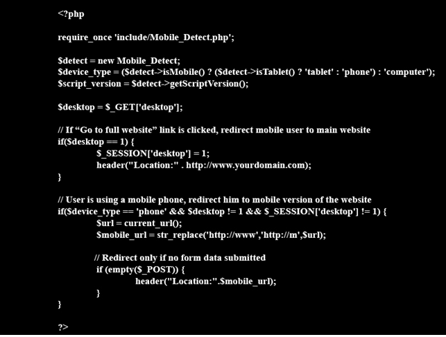

The current_url functions is use to call the following:


All is done.
I know this isn’t going to be that easy, only if you have developed your own website in PHP. And if not, you can ask your PHP development company UK to help you with this. But be sure not to delay as every minute counts and your competitors can take the lead if you have been lazy with the mobile version of your PHP website.