
UX Design Importance For Conversion Rate
There are plenty of ways for online businesses to increase their conversion rate. Some of these are: A/B (split) testing, setting up sales funnels, introducing more direct calls to action etc. One of the methods that showed the best results in last few years is by making your website more user friendly.
Unfortunatley UX (user experience) is understood only by few, in spite of the fact that it is the most important criteria for creating top quality websites. It makes sure that certain website is tailored exactly for the targeted market and that it comes with all the advantages that this group appreciates. If website doesn’t appeal to its main audience, it is likely that it will be quickly forgotten. Now when we understand the importance of UX, we should direct our attention to ways to improve it in order to increase the conversion rate of our website. In this article we’re going to provide you with six tricks that will make conversion rate on your website run wild.
-
Graphic Call to Action Buttons
If you still haven’t heard about using calls to action to increase conversion rate, this is probably the first online article you’re reading. We all know their importance, but not a lot of website administrators are trying to make them more graphic looking and creative. When it comes to WordPress websites, web designers usually add generic call to action buttons that come with the theme they’ve chosen. Premium themes usually have several options that come with zooming or hovering effects. Learning some CSS will pay off big time and it’ll enable you to create your own call to action buttons. They should be large, colorful and clickable (or tapable). You should place them in the areas, where they can be easily spotted by viewers, like in the middle of the large header picture. Tjey must be big because than it will be easier to mobile users to tap them. Small links sometimes look nice and sleek on desktop, but they can cause a lot of frustration, when you are trying to tap them on your mobile.
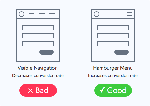
2. Make It Easier to Navigate
When it comes to commercial websites, navigation is one of the most important things. E-Commerce stores for example are used for browsing and choosing products you want to buy, which means they need to be easy to scroll. Great way to make your website better and easier to navigate is by introducing step-by-step navigation. The process of ordering should be separated in several easy steps and explained with an easy and understandable map. This will help users get in, shop, get out, and continue with their lives. Map of all ordering steps needs to be visible through the entire process, and users need to have “Go Back” option, in case they enter some wrong information.


-
Icons Draw More Attention than Text
Icons draw attention and they are very useful when readers are scrolling or scanning pages. International customers will be able to find pages or posts they were looking for, even without knowing the language, and by adding them, website’s design will look more graphic. When choosing an icon you should stick to some common designs that are widely recognizable. If you want to add some more intuitive icons, you need to label them clearly, so the users know exactly where they lead.
-
Sliders Are Trendy
By adding slider to your website’s homepage you’ll be able to present several high resolution pictures to users. Most e-commerce stores use sliders to announce special discounts and sales, with photos of products, their prices and call to action buttons that lead directly to shopping cart. There is lots of different information that can be shared with sliders and website administrators need to make them easier to use, by decreasing their speed and text that comes with each slide. If you want to introduce the slider, try it yourself foirst. Open your home page and try to have a good look on the picture and to read all the information that comes with each slide before it’s replaced with the next one.
-
Leave Some Space
Most web designers think that empty space on the website’s homepage needs to be filled. This is wrong, white space could be viewed as an afterthought in user interface design. Proper use of white space shifts user’s focus on call to action buttons and other homepage attention seekers. In addition to this websites with more white space are easier to look at and by most perceptions look more open, welcoming and accessible.
-
Hire an Expert
Sometimes for people who are not into web design the best solution is to hire professionals to make their website more user friendly. Good web designer professionals are not easy to find, so before you hire a freelancer or digital agency for this business be sure to check their portfolio, recommendations, partners they worked with and awards and prizes (if they have any).
User experience is not the only thing that influences website’s conversion rate, but it’s definitely one of the most important criteria for turning visitors into customers. You need to make your website appealing, because with so many commercial websites online, people choose only the ones they find the most useful.