
Best Tips To Improve Your Responsive Web Design
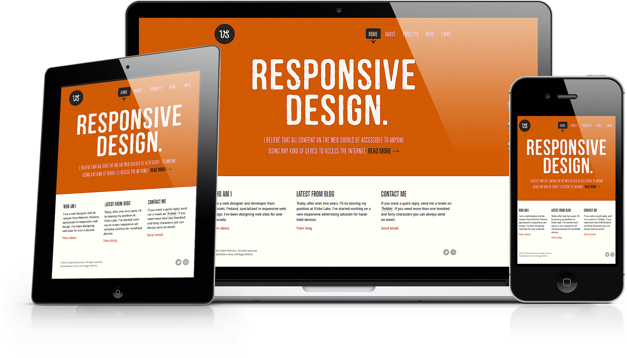
A responsive web design is a basic and the most essential element of web design that accommodates itself to any screen size. The quality of a responsive website design also depends on what features are utilized to build it. Below listed are a few features that can let your responsive website attract attention.
This day and age, people prefer to sail through their mobile device, rather desktop computer, to access online searches. Therefore, it is very important to cater all the needs and expectations of mobile users. However, many people still use a desktop computer for their appropriate online searches. Therefore, it is key to offer the same superior browsing experience through all devices.
By and large, your website should provide similar content across all devices. Every aspect of your website content varies as per the device size. It is very important to let visitors easily get into the information they are surfing for, either through a mobile phone, or a tablet or even a desktop computer. If visitors are able to acquire their needed information with an ease, they most possibly will get engaged with your offered service or brand and will also make you earn more leads and more business as well.
A website design consists of much more than just making it effective for mobile devices. This can be a hassle for your prospective visitors who are using mobile phones to access internet, as they might require a lot of time to zoom and click each time. It could especially be a fight for visitors with fat fingers. Unfortunately, they could click the wrong button or type wrong letters. Instead, a responsive website with scalable navigation can vary as per the unique needs of each device.
Scalable navigation allows viewers to sail through a website with an ease, doesn’t matter whatever device is being used. Like, it might show up the navigation bar on the top portion of the mobile device, whereas on the left side of a desktop computer. A professional website design company can educate you about the specific types of navigation that can accurately work for your responsive website.
Erroneously people use large images for all devices. Remember, large images are suitable only for larger screens. They can for sure slow down the loading times on devices with smaller screens. Seeing that, to improve the quality of your responsive website, use rather scalable images that can adapt itself according to the device that is being used.

When needed, eliminate a few of your images. This can help your website page load quicker than ever on all devices. A responsive website should be able to load contents quickly and visually appealing to any size of devices.
People that access internet through mobile devices or say small screen devices have different expectations and requirements than from those that use a desktop computer. Like, mobile users expect immediate information for their local searches. Hence, it is very important to check out that your responsive website design is having the ability to offer relevant content or information to the visitors in terms of the devices they are working on.
Like, the contact information, content and buy buttons should appear on your website homepage when using a mobile device, whereas place blogs, articles or other extra material on the front page when the device is a desktop computer. This way, your potential audiences would be able to get to their expected content quickly regardless of whatever device they are using.
For numerous years, typing was the common way of entering information across the web. But now the smart phones have altered the way of searching. Most internet users today use their smart phones to access internet. On this account, gets a responsive website design taking the touch screen devices into consideration. Your website should own an easy to use design allowing the users to navigate through their touch screen devices with and ease.
One more feature of touch screen, i.e. swiping, lets your audiences move to their required information more easily. Creating a web site design considering touch screen devices, you would be able to offer a smoother user experience that would further encourage your prospective visitors to click to your website and stay.
Once for all, improve your responsive website ramping up simplicity into your design. It would any time be better to create unique web designs. Special effects, fancy designs and other similar qualities are the yesteryear’s standards. Actually, these qualities lower down the loading speed and make fetching up the information harder through a mobile website. Efficiently make proper use of white space, lessen the size and number of images, and utilize simpler and clearer fonts that can be read easily.
Creating a responsive web design is the most important step towards a successful website. All these above mentioned qualities can be accurately used by hiring a professional website development company to create a beautiful website, with not compromising the performance on any sized device.
Source: http://www.cswebsolutions.ca